Tips ‘n’ Tricks #2
A few more ways to make your text only output look funky/clear/interesting…
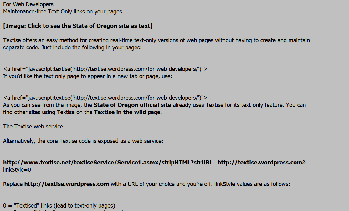
Easy on the eye
Black Tahoma font, 18pt, on a silver background. Like Sunday morning.
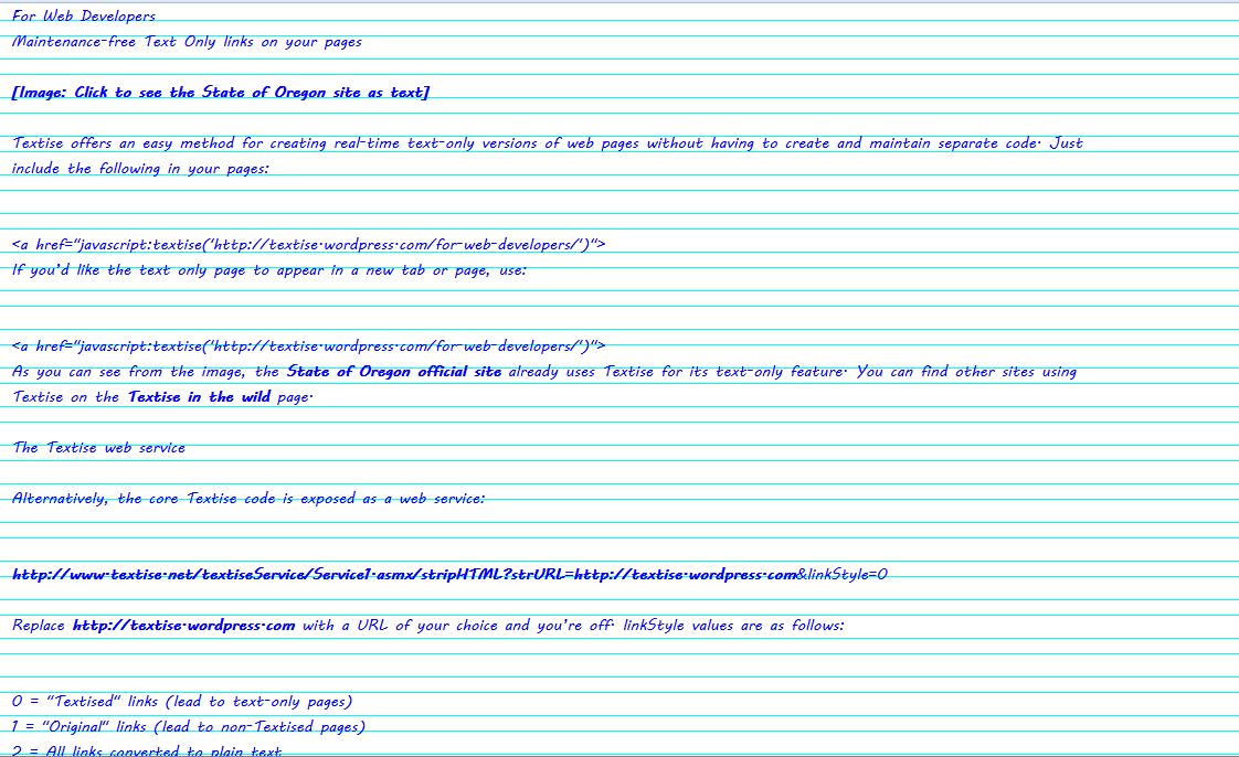
Exercise book
Proper old skool, this one. It uses the “Lined paper” background texture and the MV Boli font in blue. Add smudges and doodles to taste.
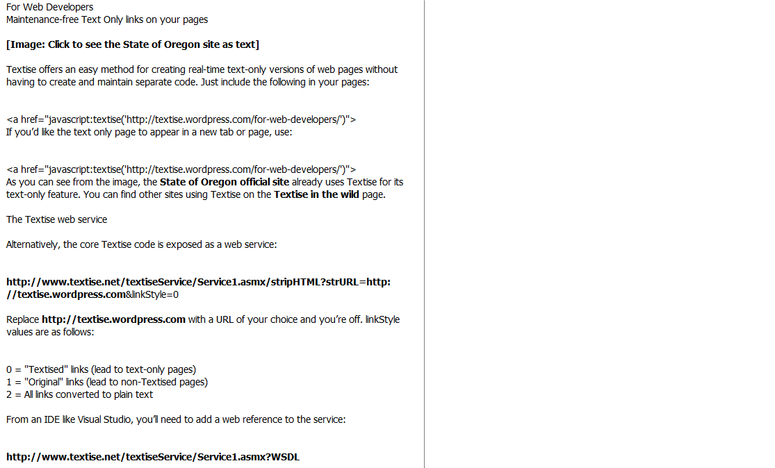
Column
You can make text easier to read by restricting its width on the page: reducing eye/head movement is important in reducing eye strain. Use the “Text width” option to set a comfortable size. You can optionally add a border on the right-hand side, dotted or solid (it’s dotted in this example).
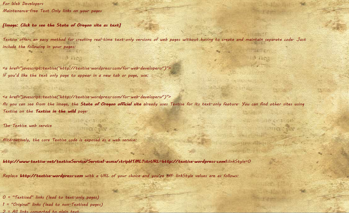
Manuscript
This is fun – you can make any web page look like something out the Lord Of The Rings or the Dark Ages. Just select “Manuscript” from the background texture drop-down and Maroon MV Boli.
After writing this post I’ve been inspired to have a look for some more textures – and I might have a look at using Google fonts too. Keep an eye out!
0 Comments